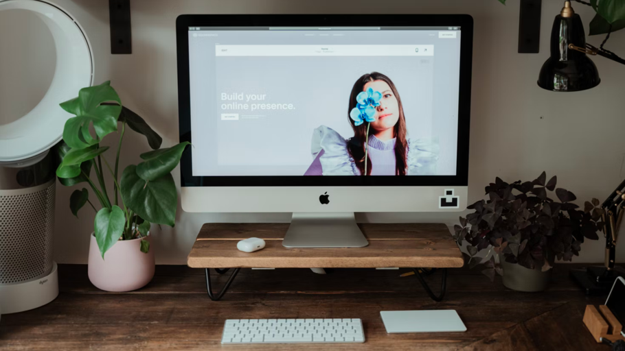
If you’ve listened to any podcast ever, you already know the spiel: Squarespace is an all-in-one website builder that makes it easy to create a professional-looking online presence. Numbers-wise, it’s the second most popular web builder out there (after Wix) and the third most popular hosting service (after Wix and Shopify), supporting more than 2.8 million live websites across the internet at the time of publication.
One of the primary reasons why Squarespace has seen this success — well, aside from all of those Ira Glass-narrated ad slots — is that you don't need any web design or coding experience to get a beautiful site up and running on its platform. With intuitive drag-and-drop building elements and a vast selection of ultra-modern templates, it's easily one of the most beginner-friendly tools of its kind.
Truthfully, the hardest part about designing a Squarespace site is often just choosing one of those templates — there are 234 of them across Squarespace versions 7.0 and 7.1, the two iterations of the platform that are currently supported. How do you decide which one to use for your oil painting portfolio, your Taiwanese-American food blog, or the online store for your cool-girl jeans? (Those are all different kinds of websites that have been made with Squarespace, FYI.)
Let's get into it — but first, a quick primer.
Why should I use Squarespace?
After fast and easy site design, the best thing about Squarespace is its all-in-one approach: Your plan includes 24/7 customer support, website metrics, SEO features, SSL security, unlimited bandwidth, and video storage, all for as low as US$14 a month. (That gets even cheaper if you go with a long-term plan, by the way.) Squarespace also throws in fully managed cloud hosting at no extra cost, plus a year's worth of a new custom domain if you sign up for an annual membership. No need to set anything else up with another provider or platform.
What is a Squarespace template, exactly?
A Squarespace template (or theme) is a pre-designed, ready-to-use demo website that you can customize with different colors, pages, fonts, and drag-and-drop element blocks like text, images, galleries, buttons, and forms. Squarespace describes them as "a starting point to help inspire your site's design," noting that "[you] can keep the structure of your original design intact by replacing the demo content with your own, or you can completely change the design of your site and start from scratch."
Each template has been built exclusively for Squarespace, which means you won’t find them on WordPress, Wix, or other site-building platforms.
Are Squarespace templates mobile-friendly?
All Squarespace templates are mobile-optimized from the jump, which is awesome for two reasons: Mobile-friendly sites look great on all devices and get higher priority from Google when it comes to indexing and SEO rankings.
Templates from Squarespace version 7.0 have separate mobile styles that activate on smaller devices, while their version 7.1 counterparts adapt to mobile view automatically. (More on those in a sec.) Check out Squarespace's tips on how to keep your site mobile-friendly as you continue to build it out.
Which version of Squarespace is better: 7.0 or 7.1?
Squarespace version 7.0 categorizes its 91 templates into certain template "families," which are groups of similarly coded templates alike in their basic structure and functionality. Each one has its own rules and customization options, which means you sometimes need to swap templates and start over (and risk losing content) if you're after a specific feature. Squarespace did away with these families with the release of version 7.1 in early 2020, giving all 143 of its new templates the same features and underlying structure to make it easier to change your site's style in seconds.
That being said, neither version is conclusively "better" than the other. Version 7.1 is probably the ideal choice for people who are new to Squarespace since its template formatting streamlines the design process, but if you've built a site on the platform before, you may want to stick with version 7.0 — its templates have a bunch of advanced features that haven't been added to the new ones yet. (See: parallax scrolling, one especially popular feature of the beloved Brine template family that's missing from version 7.1; people were pretty salty about that one.)
One caveat: While it’s possible to switch between versions 7.0 and 7.1, doing so will usually require a full rebuild and mess with your site's search ranking. On the bright side, Squarespace offers a free 14-day trial so you can noodle around with both versions before you commit.
Is Squarespace better than WordPress?
This one's pretty situational. WordPress is best for people on either end of the customization spectrum: You can use the free version to create a super basic blog, or go balls-to-the-wall on a totally unique, from-scratch website with premium themes and tens of thousands of plugins. Keep in mind that the latter requires managing your own hosting, security, and updates; you may also need to hire a developer if your coding skills aren't up to par.
Squarespace's templates are less flexible than a custom-built WordPress site and lean hard on visuals, but they already have some great built-in features and look pretty snazzy right out of the gate — plus, all of the technical drudgery is handled by the platform itself.
Squarespace also supports the official integrations of certain services, including Apple News (to cross-publish your content), Paypal (to accept payments), and OpenTable (to let guests make reservations), along with a couple dozen third-party extensions. While not as prolific as WordPress plugins, they should be able to meet most of your and your users' needs, no problem.
For a deeper dive into the differences and similarities between Squarespace and WordPress, click here.
How do you find the right Squarespace template for you?
To get started, head over to the Templates tab on Squarespace's website and filter its library by Type and Topic to narrow down your pool of candidates. You can hit "Preview" on any theme that catches your eye to see what it would look like in the wild.
Squarespace recommends choosing a template based on your favorite colors and layouts rather than the demo content you see there: "You can change the style and layout of your site at any time, but you may find it easier to start with a design that's already close to how you want your site to appear," reads a page on its Help Center. "For example, the Dario demo site is designed for a wedding, but you could adapt it to accept RSVPs for a different type of event, or to gather pre-orders for a new product launch."
If you're having trouble settling on one, know this: It's basically impossible to make an ugly Squarespace site, and with enough time and experimentation, you can tweak almost any template to fit your exact vision and needs. But just in case you need a nudge in a certain direction, keep reading: Below, we've rounded up 15 of the best Squarespace templates for all sorts of sites.
Note: Most of our recommendations are from Squarespace version 7.1, but we've sprinkled in a few options from version 7.0 that continue to stand out. Templates have been labeled accordingly.
Brine
Best For Business
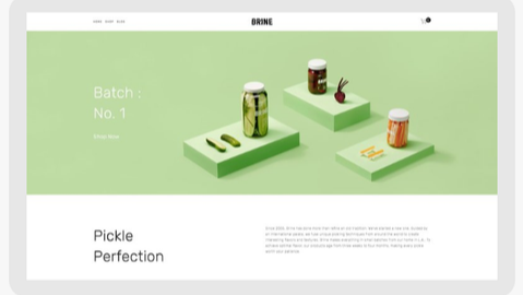
- Family: Brine
- Squarespace version: 7.0
This bad boy is the parent template of the Brine family, the biggest and one of the most popular template families on Squarespace, and the one that gives you the most style control for both desktop and mobile.
Brine was specifically designed for brands and companies who want a top-notch web presence with an active blog, some sophisticated ecommerce features, and a stellar balance of text and images.
Brine gives you lots of options to play around with design-wise, including a stacked parallax-scrolling index page, advanced commerce features like on-hover effects, a content inset feature that can be used to draw attention to special announcements, multiple navigation areas, multiple blog layouts, custom share buttons, full-width banners and headers, and so much more.
Novo
Best for graphic designers
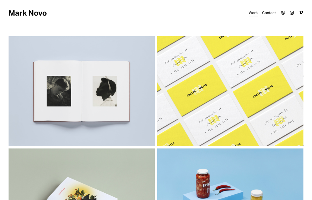
- Squarespace version: 7.1
Novo is a newer, bolder black-and-white template that's well-suited for a graphic or product design portfolio. This one also puts your work front and center in a grid on the home page — we like that there's a hover-over effect for each title — then whisks users away to project-specific pages with brief descriptions and full-bleed banner images. Modern icons for your Dribbble, Vimeo, and Instagram accounts are already in the top and bottom navigation bars, so you just need to add your links.
Honorable mentions: Cami (7.1), Kester (7.1), Utica (7.1), and York (7.0).
Mérida
Best for bloggers
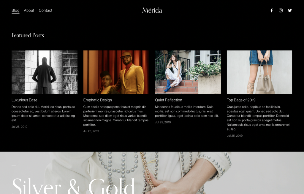
- Squarespace version: 7.1
Mérida is a magazine-style template that does a fantastic job of making a lot of text look interesting, breaking it up with different "featured post" grids and banners so you're not just staring at a huge wall of words. For this reason, it keeps its menus pretty simple — just a couple of navigation links and social icons that don't compete with your content. Anyone who prefers browsing and reading in Dark Mode will appreciate its posts' white-on-black formatting, which looks super elegant and modern.
Honorable mentions: Brower (7.1), Fillmore (7.1), Forte (7.0), Idrah (7.1), and Stanton (7.1). Click here for more recommendations and tips on how to pick the right Squarespace template for blogging.
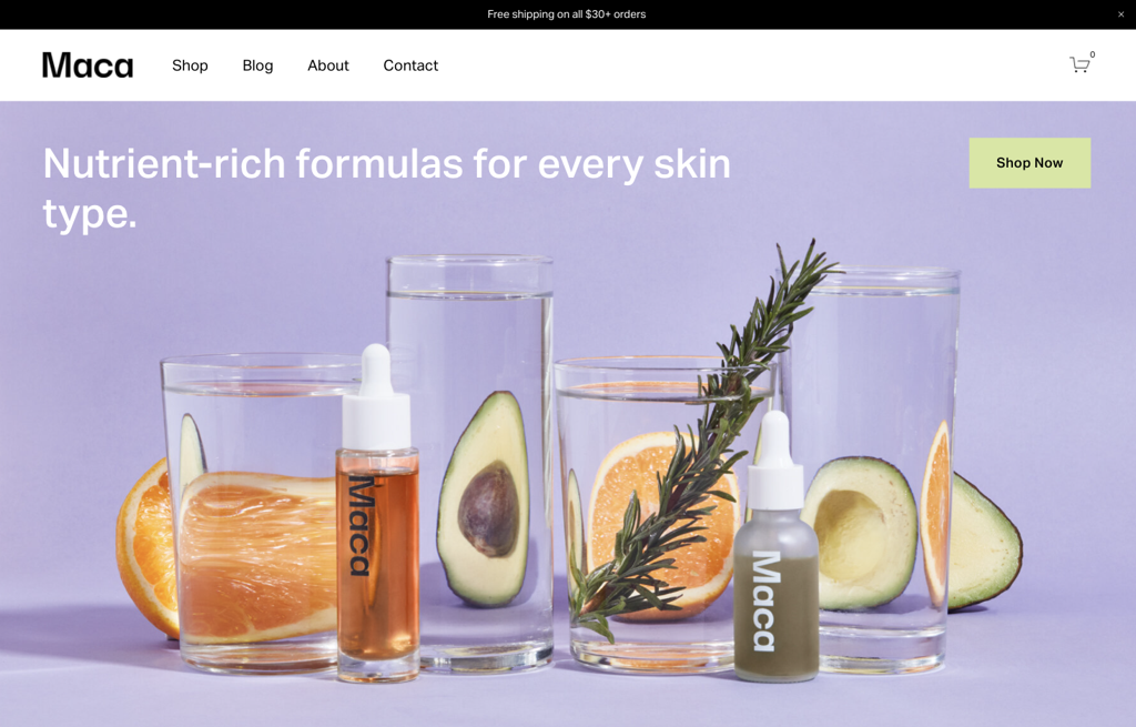
Maca
Best for online stores
- Squarespace version: 7.1
All Squarespace templates support its commerce features, including customized checkout, customer email notifications, and marketing, but you can get your online shop off the ground sooner with a tailor-made template like Maca. (Peep the stockist, FAQ, terms of use, and shipping/return links that are already set up for you in the bottom navigation.) Its layout plays around with color and negative space in a really smart way — it's visually interesting but not distracting. It also gives you tons of different ways to organize your products, with preset sections for featured collections, bestsellers, and sale items.
Honorable mentions: Alameda (7.1), Anise (7.1), Granger (7.1), Hester (7.1), Jotter (7.1), Loam (7.1), Mariana (7.1), and Skyloop (7.1).
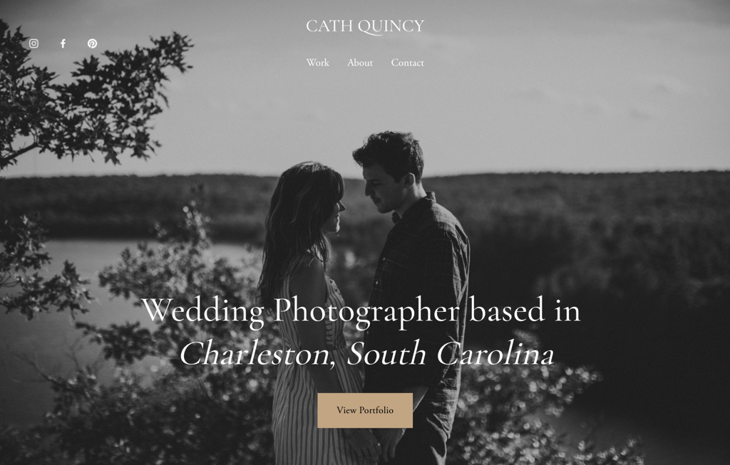
Quincy
Best for photographers
- Squarespace version: 7.1
Photographers barely need to make any changes to the demo version of Quincy: It's got a show-stopping landing page, a pretty portfolio page with changing full-bleed background images, and easy-to-find social icons. But the very best part is its contact page: It's got a ready-made form where potential clients can submit important information like their event type, date, venue, and referral info. It'll make scheduling a breeze so you can spend more time doing what you love (actually taking pictures) and less time trying to get booked.
Honorable mentions: Elliot (7.1), Laurie (7.1), and Tepito (7.1).
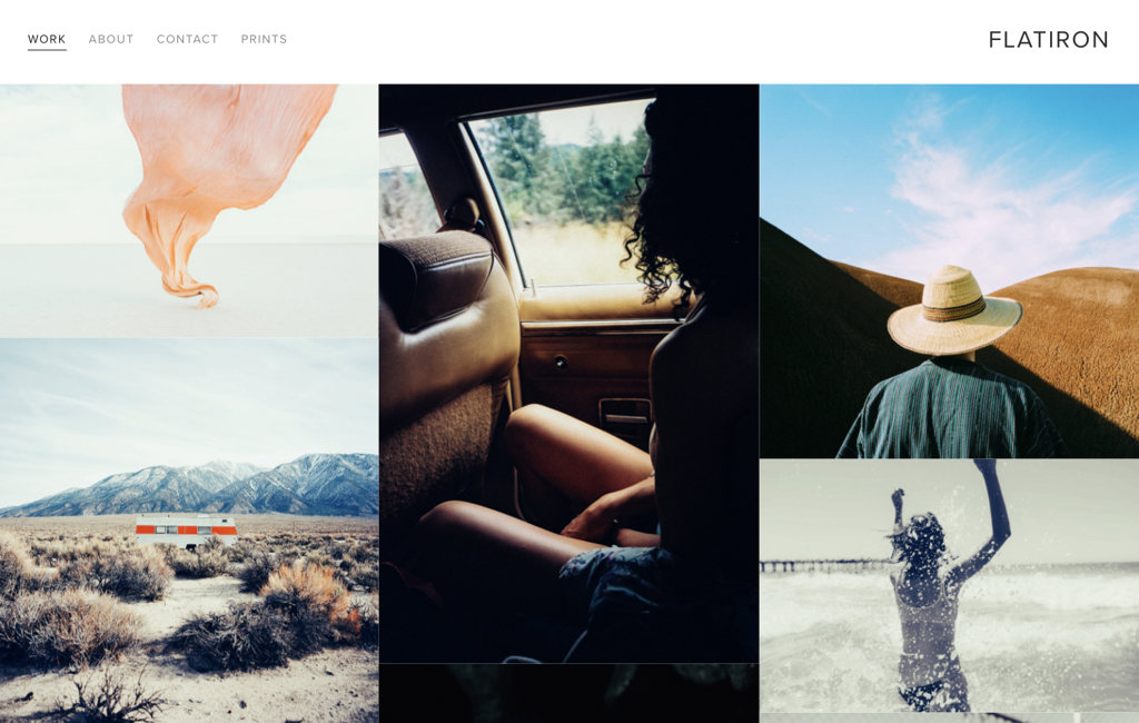
Flatiron
Best for artists
- Squarespace version: 7.0
Flatiron is a light and airy template that's been around since Squarespace's inception in 2012, and it's a true oldie-but-goodie for creative types. Its grid-style homepage presents a nice overview of your work; users can click on each thumbnail to see the full-size version with a detailed caption — feel free to wax poetic about your process or inspiration there. (Many similar Squarespace version 7.1 templates are sorely lacking this feature.) Flatiron also supports store pages in case you want to start selling prints, though it can easily stand on its own as a basic portfolio site.
Honorable mentions: Beaumont (7.1), Montclaire (7.1), Spotted (7.1), and Wells (7.0).
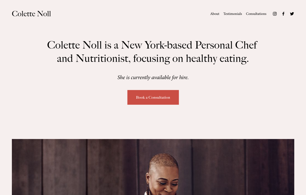
Noll
Best for a personal website/CV
- Squarespace version: 7.1
A personal website can make it easier for companies and recruiters to find you, and a template like Noll will add some much-needed "wow" factor. It works really well as a one-page site with a bio, a brief summary of your qualifications, your work experience/skills, and a headshot, but you can also add dedicated pages for testimonials, reviews, and a contact form. Either way, it looks very trendy (dare we say millennial-chic?) with those serif fonts and peach/scarlet color scheme.
Honorable mentions: Hart (7.1), Otto (7.1), Pursuit (7.0), and Waverly (7.1).
Sundew
Best for podcasts
- Squarespace version: 7.1
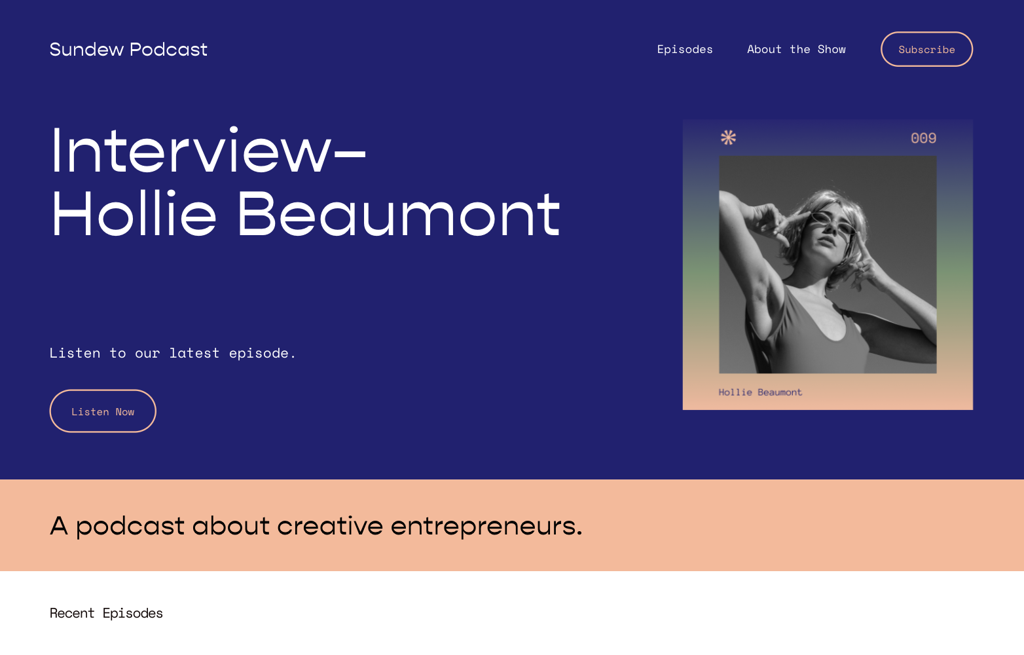
With groovy gradients and matching sunburst accents, Squarespace's Sundew template is on point with this year's '70s-inspired design trends. Its demo site eagerly awaits your podcast: There's a spot for your freshest episode right at the top, followed by a banner with your tagline, a grid of recent episodes, a prompt to sign up for your newsletter or email list, and a blurb about the host(s) that directs to a more in-depth bio page. Each individual episode page gets its own audio block so listeners can tune in without having to leave the site, though links to your Spotify, Stitcher, Apple Podcasts, and Google Podcasts pages have been scattered throughout in case they prefer a different platform.
Honorable mentions: Paloma (7.1).
Zorayda
Best for a launch page
- Squarespace version: 7.1
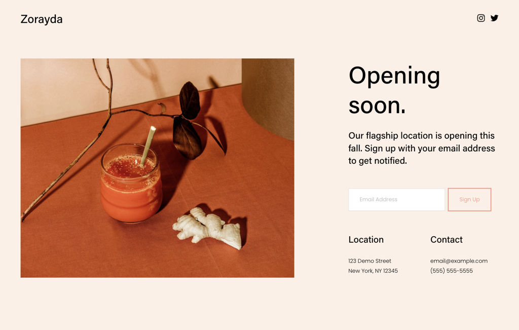
Got something new in the works? It doesn't need to be a full-on, fleshed-out website yet — just make a pre-launch landing page (also known as a coming soon page) with the help of a template like Zorayda to stake its claim on the web. Featuring a light background and some simple sans-serif typefaces, the demo version has spots for all of your must-know info, a standalone image, and a newsletter/email block where visitors can sign up for updates. It's worth noting that this one's a version 7.1 template, which means you can easily switch themes down the road without losing any of your content.
Honorable mentions: Randi (7.1), Sellwood (7.1), Tantillo (7.1), and Toledo (7.1).
Atlantic
Best for restaurants
- Squarespace version: 7.1
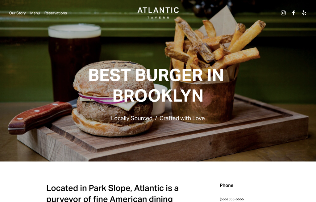
Another template that would make a great one-pager, Atlantic is ready to go for a restaurant: It kicks off with an "about" section featuring all of your most important info (location, hours, etc.), followed by a rotating image gallery and pre-formatted sections for two different menus. You'll also find a "reservations" page with an OpenTable block; bonus points for the Yelp icon in the social widget, too. The color scheme keeps things simple with black text on a white background so as not to distract from the mouth-watering pictures of your plates.
Honorable mentions: Blend (7.1), Chotto (7.1), Hill (7.1), Juniper (7.1), Palmer (7.1), Pine (7.1), and Vance (7.1).
Follow Mashable SEA on Facebook, Twitter, Instagram, YouTube, and Telegram.
Recommended For You
-
 Tesla’s Full Self-Driving software is under federal investigationThe National Highway Traffic Safety Administration’s (NHTSA) Office of Defects is looking into Elon Musk's company.
 -
 Google Maps is tweaking its look to improve the experienceWeather goes somewhere else now.
 -
 X to allow third parties to train AI on your postsYou can't opt out yet.
 -
 60+ of the absolute best stocking stuffers for 2024We all know stockings are the best part of Christmas morning, so don't screw this up.
 -
 Bluesky gains half a million new users in one day after X changes how blocking worksPerhaps people want 'block' to, y'know, block people.
Trending on Mashable
-
 Here's What You Can Expect From The MSA Awards & Festival 2024 Happening This WeekThe event will feature well-known personalities such as Khairy Jamaludin, Shahril Hamdan, and Khairul Aming.
 -
 Samsung's Latest Flip Devices Launched In Paris Are Powered By Galaxy AIThe Galaxy AI in each unique foldable device is a formidable driving force for everyday needs.
 -
 Here's A First Look At Samsung's New Wearables: Galaxy Watch7 and Galaxy Watch UltraThe wearables offer innovative health experiences, enhancing everyday wellness with intelligent features.
 -
 Endeavor Wraps Up MatchCAP Asia 2024 With Record-Breaking SuccessFostering deeper connections between entrepreneurs and investors.
 -
 Enjoy More Flexibility With Disney+ Hotstar’s New Monthly & Annual PlansWatch an ever-growing collection of movies and series with lower commitments!
